
Logo & branding design for a local silversmith.
Silver Thistle Workshop creates silver jewellery with a Scottish theme, using recycled silver and sustainable eco-friendly gemstones. Most of the jewellery are one-off pieces, there will never be another one exactly the same.
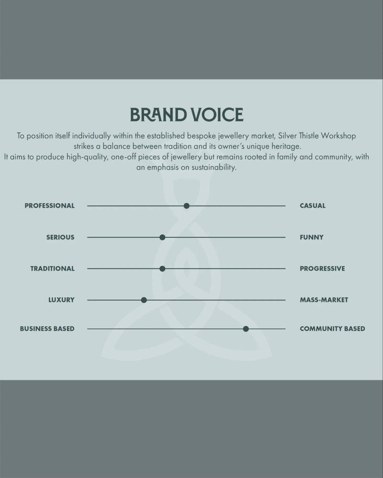
Silver Thistle Workshop’s values are happiness, empathy, family and heritage, paying tribute to the owner’s late mother and the family’s Scottish Heritage.
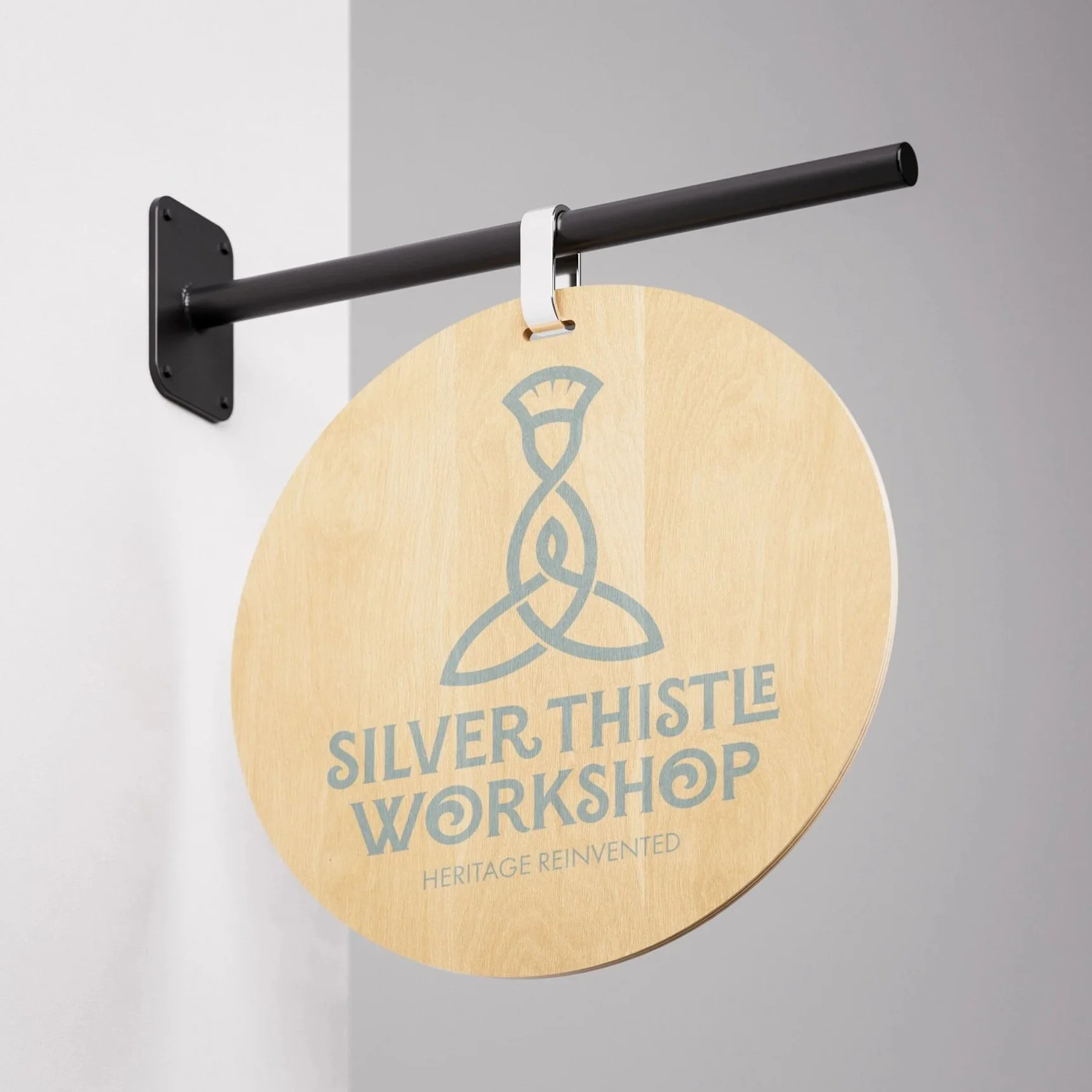
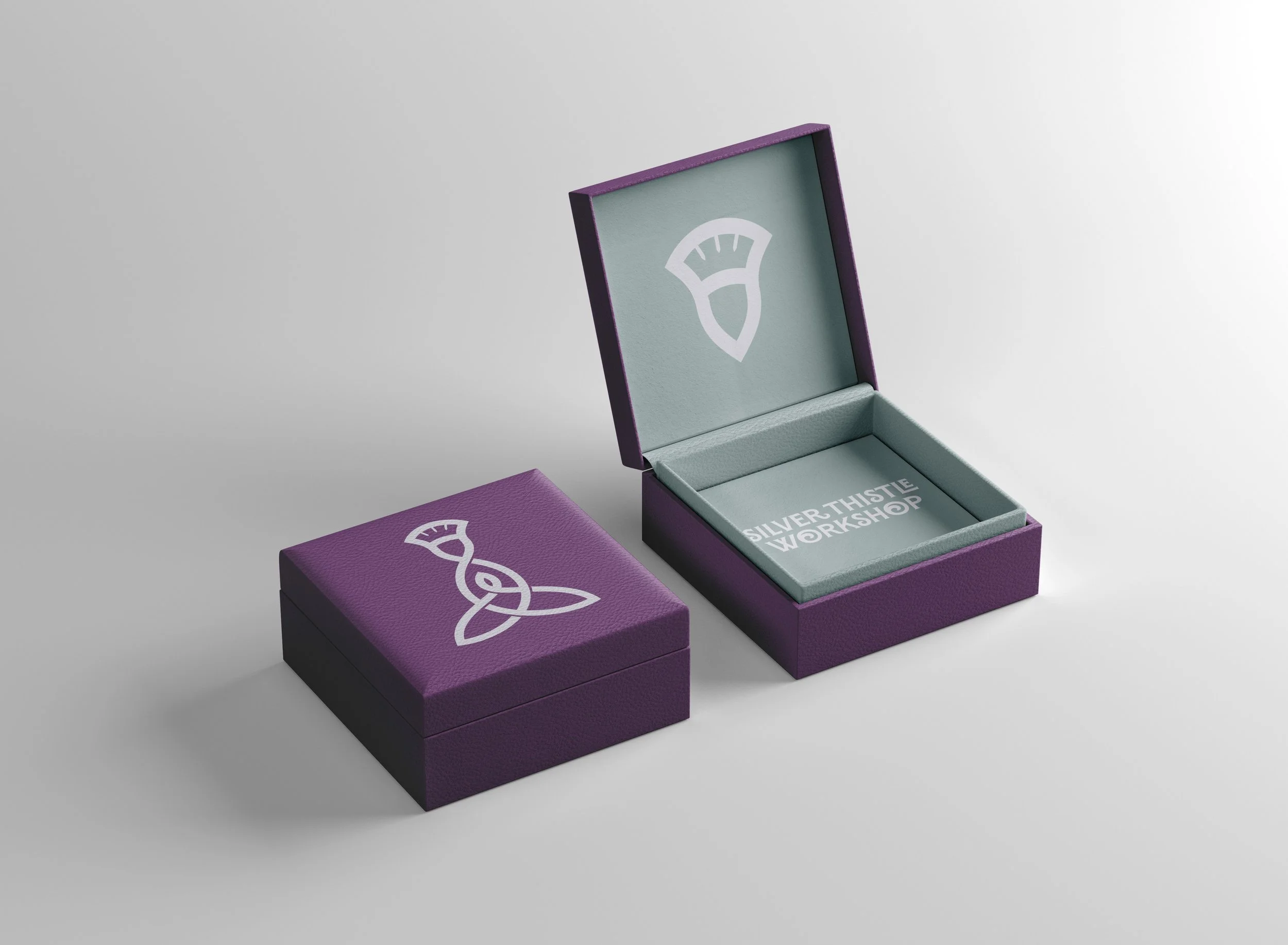
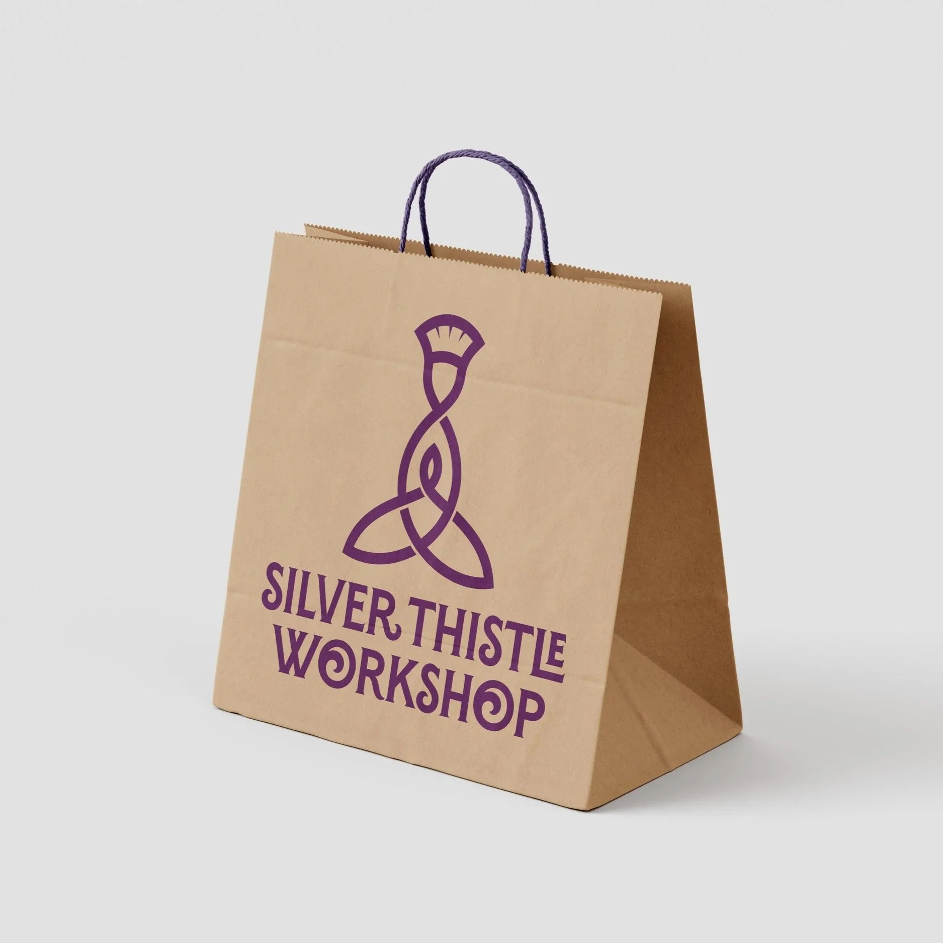
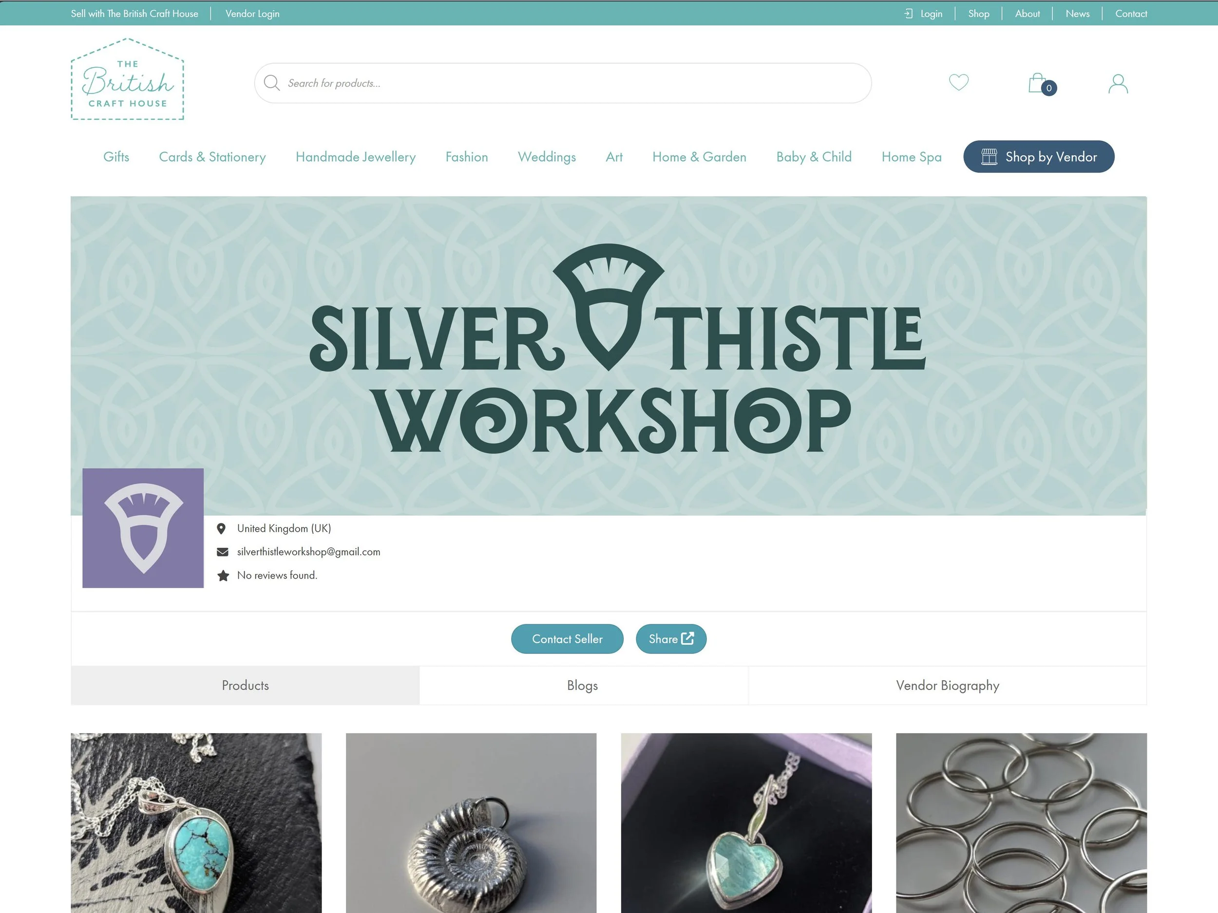
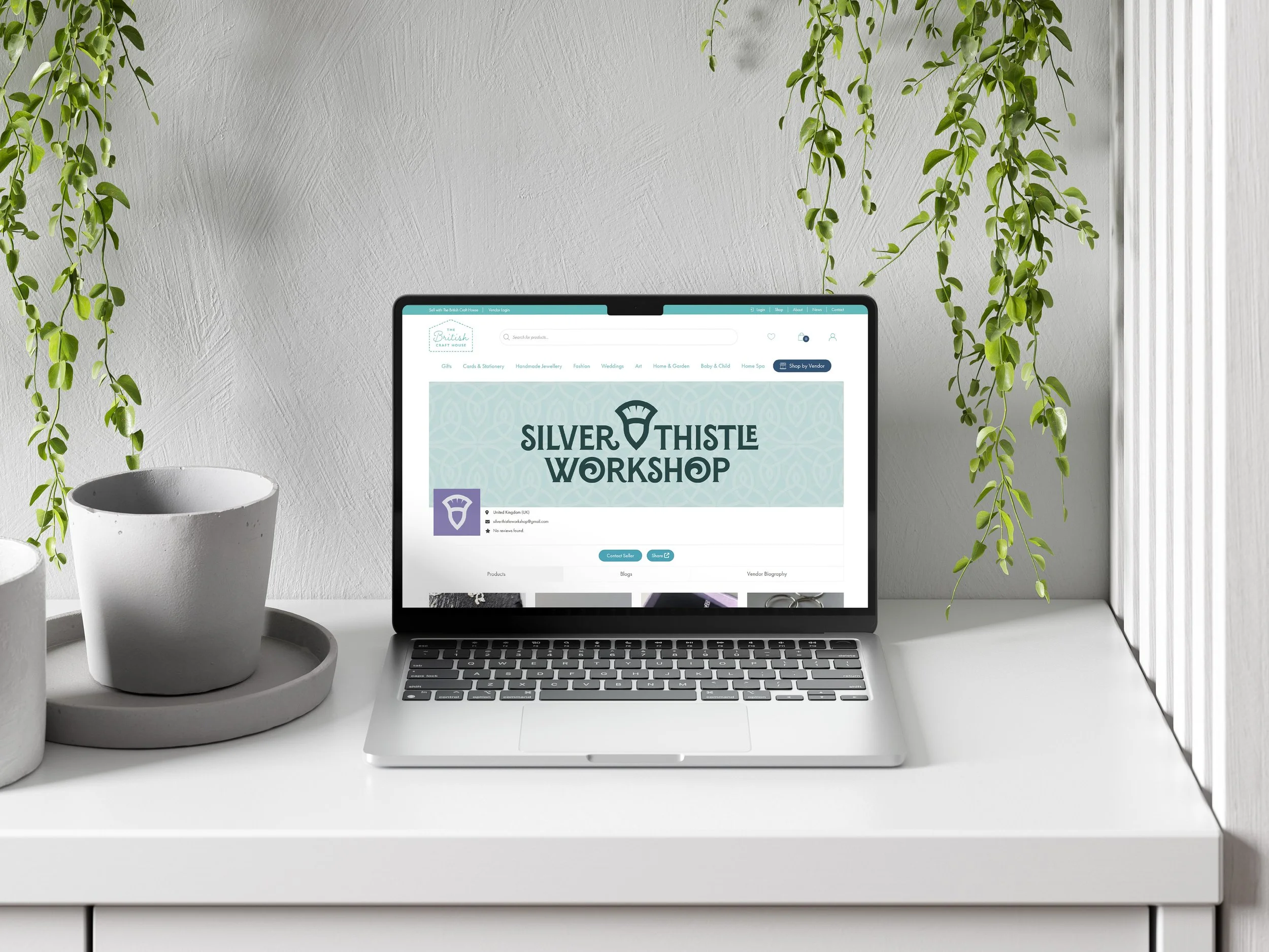
The Primary Logo combines a Celtic Motherhood knot with a stylised thistle design, with alternate logomarks, a wordmark, patterns and full branding guidelines.
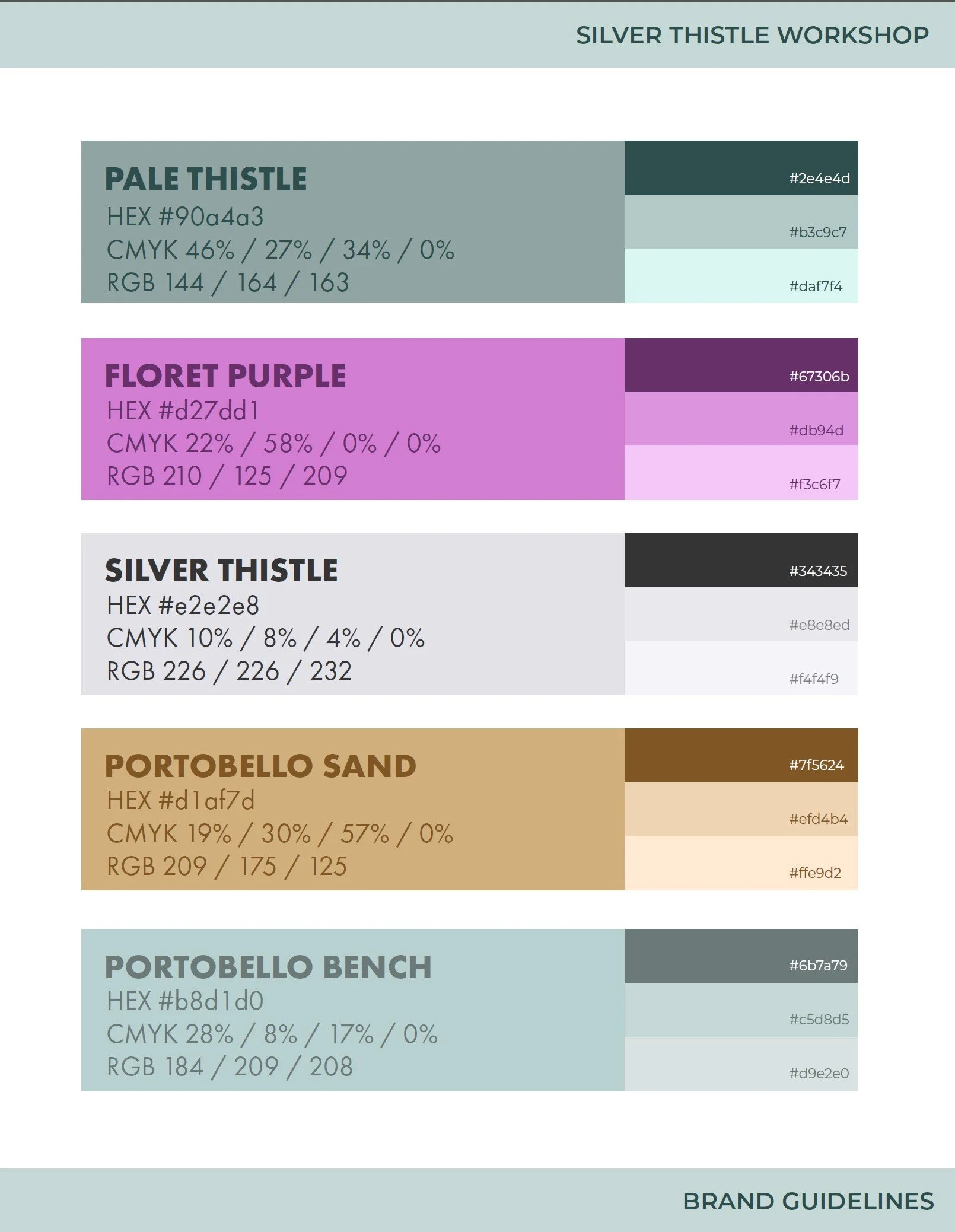
The owner was keen to emphasise the Scottish Heritage of the brand, and she wanted to use a thistle element as well as the traditional colours of green and purple.
The challenge was to do this in a unique way that stood out from the crowd. To do this we tapped into the owner’s family history and especially that of her Scottish mother, who had sadly passed away. The stylised thistle element at the top represents the owner’s mother as the head of the family and the motherhood knot itself represents a mother holding a child within its arms.
It is designed to reflect the Scottish family heritage of the owner, while presenting a modern and unique twist on the Scottish Thistle. It is deliberately clean and sophisticated to position the company within the established jewellery marketplace.
The logomark is unusual and unique enough for the audience to question what it represents, allowing for conversations around the meaning of the motherhood knot and how this relates to the owner’s heritage.